The Pivot table function in CoreView allows you to reorganize, summarize, and analyze report data in a flexible way. This guide explains how to access the feature, use it, export results, and save your configurations as custom reports.
Accessing the Pivot table feature
Note: depending on your CoreView solution and/or the add-ons purchased, some of the following reports might not be available to you.
You can enable the Pivot toggle in the following reports:
Users
All user reports, except:
- Users analyzer
Groups
- Distribution groups
- Microsoft 365 groups
- Empty Microsoft 365 groups
- Security groups
License
- Microsoft 365 Apps Center
- Users without license
- Disabled license users
Devices
- Intune devices
Exchange
- Email addresses
- Exchange inactive mailboxes
- Email activity
- Email app usage
- Mailbox usage
- Mailbox sizes
- Mailbox without license
- Shared mailboxes without delegates
- Archive size
- Recipients by type
- User audit status
- With archive mailbox
- With forwarding
- With auto-reply
- Users by connection type
- Users by retention policy
SharePoint
All reports except:
- SharePoint activity
- SharePoint inactive users
- SharePoint recycle bin
OneDrive
- OneDrive sizes
- OneDrive statistics
Teams
- Teams user activity
- Teams users
- Teams inactive users
- Teams device usage
- Teams groups, groups activity
- Teams members, external members
- Private and shared channel members
Teams Voice
- Teams voice users
- Auto attendants
- Call queues
Security
- User mailbox security
- User accessing multiple mailboxes
- Mailboxes with delegates
- Licensed users with admin roles
- Users with admin roles
Mail traffic
- Mail traffic
- Mail traffic by user
- Top senders and receivers
- Low traffic mailboxes
Using Pivot tables
Enable Pivot mode
Turn the Pivot mode toggle on. By default, the toggle is switched off.
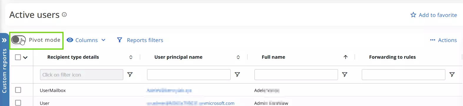
When enabled, the way you visualize your report will shift, and a new selection panel will appear.

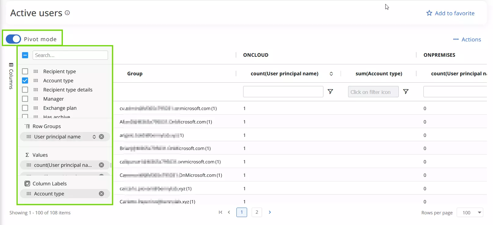
Select and organize data
Select the desired attributes and position them into column labels, row groups, or values to customize your data. Use the drag indicator to move the elements.
- In the columns field, check the items you wish to view.
- Drag attributes in the row groups, the values or column labels to filter data.
For example, if you wish to visualize the account type of active users, you could insert the “User principal name” in the row groups, “Account type” in the Column labels, and the “count(User principal name)/sum(Account type)” in the Values field, (the field should automatically populate based on your choices) as shown below:
Now, you can:
- Analyze your data in the application.
- Export the data you selected in Excel or CVS format.
- Save the pivot as custom report.
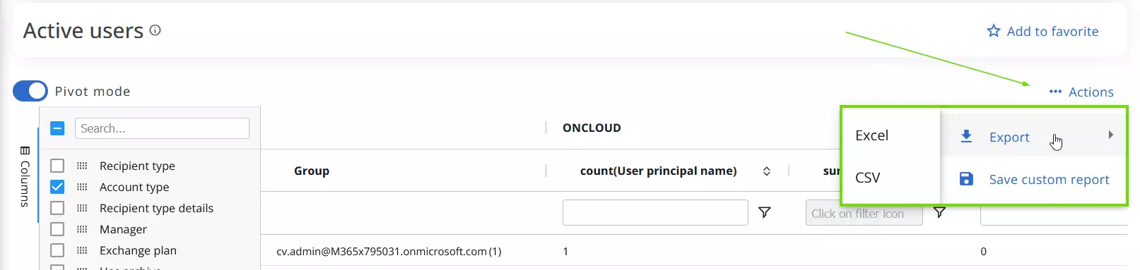
Export Pivot table
To export a report only containing the selected attributes you used to create the Pivot table,
- Select “Actions” > “Export.”
- Choose your desired format.
When you export data in Excel format, for example, you will have the same distribution you have set up in the pivot table:
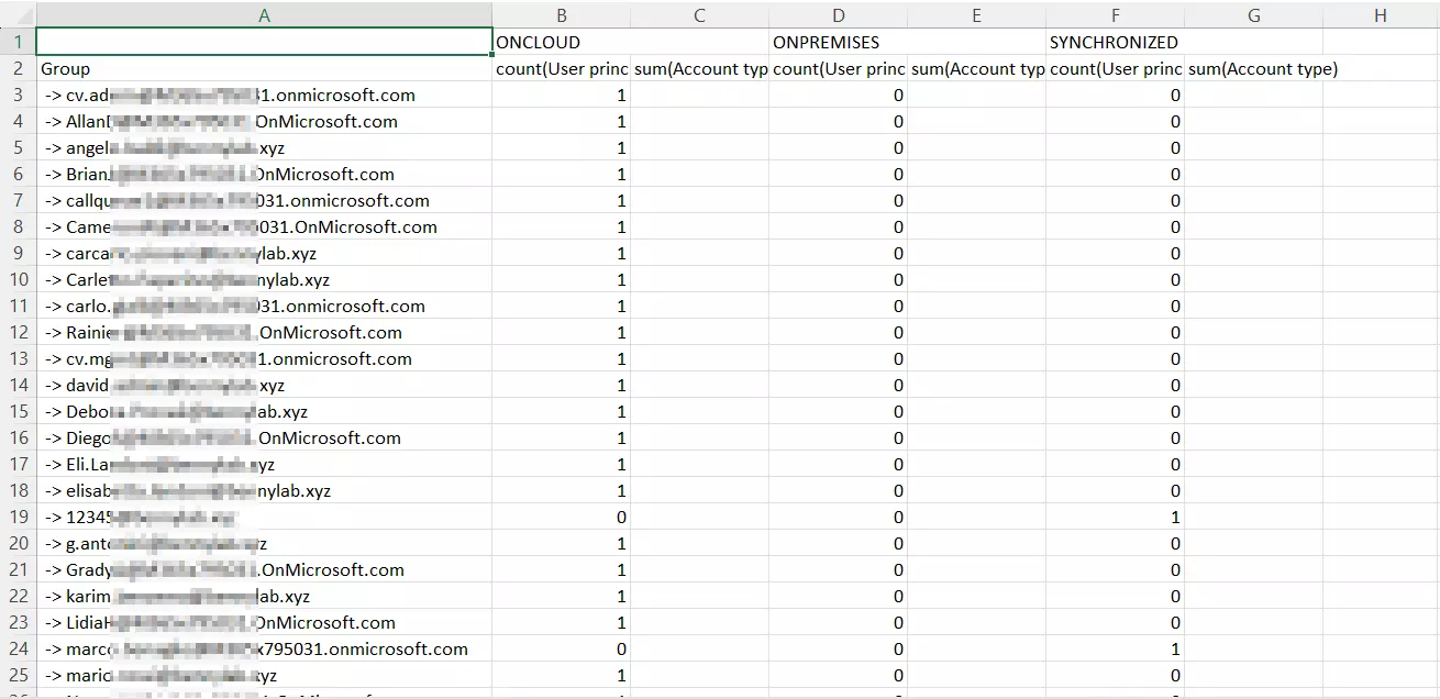
As you now have only your selected attributes in the Excel file, if you wish to, you can now recreate the pivot table directly in Excel.
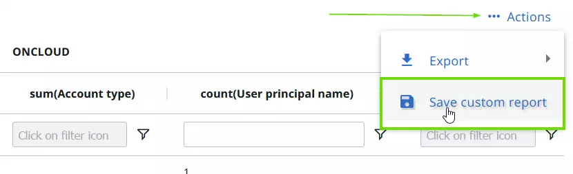
Save Pivot table as custom report
You can also save your pivot table as a custom report. To do so, follow the steps below.
- Select “Save custom report”. This will open a panel.
- Fill in all the required fields and click “Proceed” to save the report.
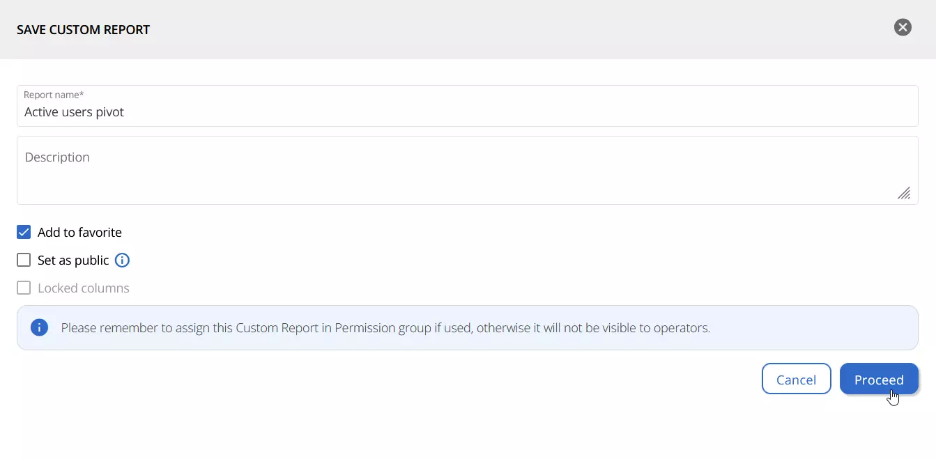

- Access it anytime under “Custom reports”.
